9 Tips for Styling Mushy Subjects
Here are tips, advice and perspectives on styling mushy subjects (AKA typical comfort foods), whether you are a beginner or further along.
That said, the supporting roles are the ones that make stories interesting—not the main characters.
A while back—years before I even knew that food photography was the path I wanted to go down—I remember randomly clicking on and reading an article by a food stylist. One of the questions in the article was about scrambled eggs, and how to make them look good despite their mushiness. Their response was not to change anything about the eggs, but to play around with the props surrounding it to tell a story.
Supporting roles, and all that. And now, as a professional food stylist, I realize how important that sentiment is, and I’ve realized that there’s a lot to learn from her statement.
Most of the time when I see food that is soft or unidentifiable, the first thing that comes to my mind isn’t ‘oooh, tasty!’ — but when I think about some of my favorite memories with food, how it looks doesn’t come up at all. Those fond memories are simply about the people I shared the food with.
After all, the title ‘comfort food’ exists for a reason — it tastes comforting, sure, but the real comfort comes from the positive experiences and familiar traditions that come with it.
When I think of my own personal comfort foods, they’re all mush: fluffy mashed potatoes, silky scrambled eggs, gooey mac and cheese, aromatic stews… you get the picture. Commonly, these are dishes that are not known for being pretty, but I bet your stomach is grumbling anyway, because you know how good they taste and how they make you feel.
That feeling is what every food photographer should be after. If you can get past the initial mushy appearance and cut straight to the feeling of enjoying that food—you’ve done the perfect job of capturing a mushy subject on camera.
Keep reading for my best tips on how to do it!
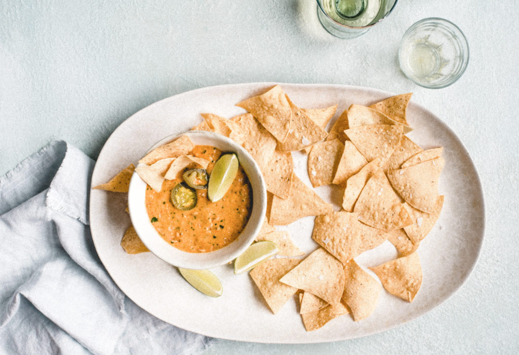
First thing for styling mushy subjects: Texture.
Have you ever noticed how commercials or magazines of frosting or mashed potatoes that are perfectly swooped with a pad of butter garnished on top? I’m assuming your answer is yes.
Now, have you ever seen mashed potatoes styled in a commercial or magazine as a just simply-plopped white blob? I’m assuming your answer to this one is no. (Me, neither.)
Considering this concept, think about texture, in the sense of adding it or taking it away. At this point, try to think about your composition like a sculpture! What can make the subject more visually appealing, when it’s rather lackluster on its own? Props will make allll the difference. Click here for a list of my must-have prop list essentials!
Second thing for styling mushy subjects: Colors.
Dealing with a subject that’s a little brown, or a little dull in saturation? Consider which colors would compliment it to make it stand out a bit more. Will pairing it with blue make it look a little more vibrant? Or how about black to add a dramatic contrast? Or even something brighter, like orange, to draw the eye in?
Ask yourself this: how can I use color to help create a story? And then dust off the old color wheel and Google an article or two about the psychology of individual colors and their pairings. This one can turn into a real rabbit hole, though—so try not to get sucked into too much science!
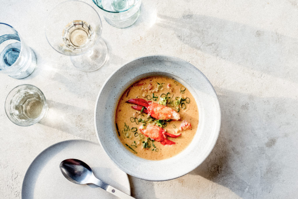
Thirdly, Layers.
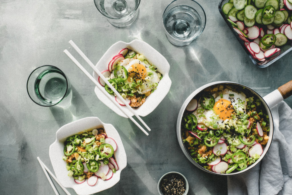
If you’re having a difficult time figuring out how to improve your image of your precious little mush, layering on some finishing touches may be just what you need. My personal go-to’s are flaky salt or black pepper.
These garnishes can add that gentle little oomph you are looking for, without much effort on your end in terms of styling. You can also experiment with flavor cues, microgreens, or a dusting of powdered or castor sugar, or a drizzle of syrup (depending on the subject). Get creative, and have fun—think of ways to add a little texture by layering.
Plus, who knows – you might even end up liking the flavor combinations more that way, too!
Lines.
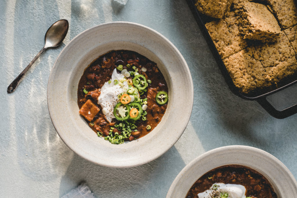
Directional lines will distract the eye from the mush, and add an elevated stylistic touch. These directional lines are easy to include; simply try adding a utensil!
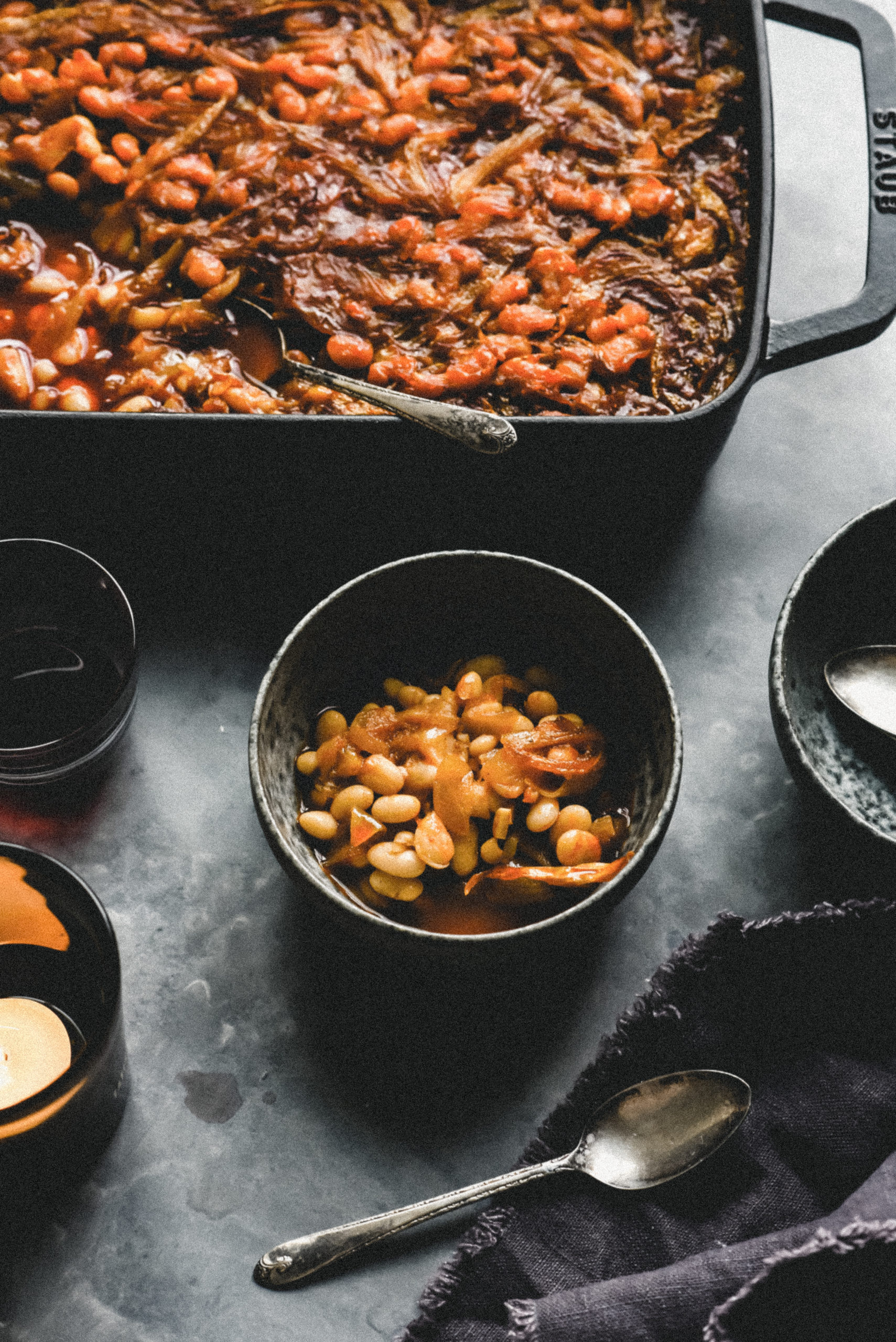
Can you add a fork, or a serving spoon, or some other item you have on hand in your kitchen to help break up where the eyes are drawn to? How can you use shapes and angles to help guide the viewer’s eye around the image? Again, play around with the composition and move the utensils this way and that until you’ve hit the sweet spot.
Imperfection.
Since we’re talkin’ comfort food… take a bite! Or a scoop out a serving! That element of imperfection will do wonders for evoking feeling. When looking at a food with a bite taken out of it, people won’t be able to help but think about how delicious the dish is; after all, the photographer couldn’t even wait to eat it!
Let’s use a casserole or mac and cheese, for example. Take a scoop out of the dish to give the appearance of sharing, or eating together. This will help add warmth to the mood, because when dining with friends and family, you would of course be enjoying the food in action versus staring at it untouched.
Additionally, this imperfection will help guide the eyes to the curve of that scoop.
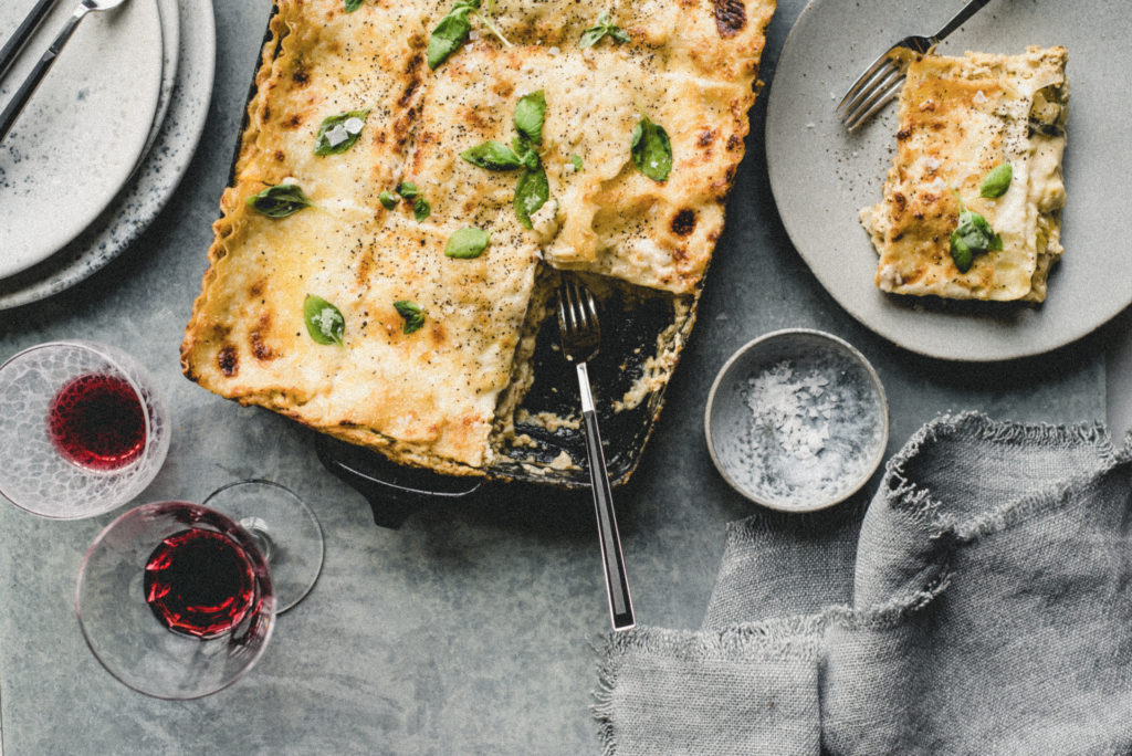
Division.
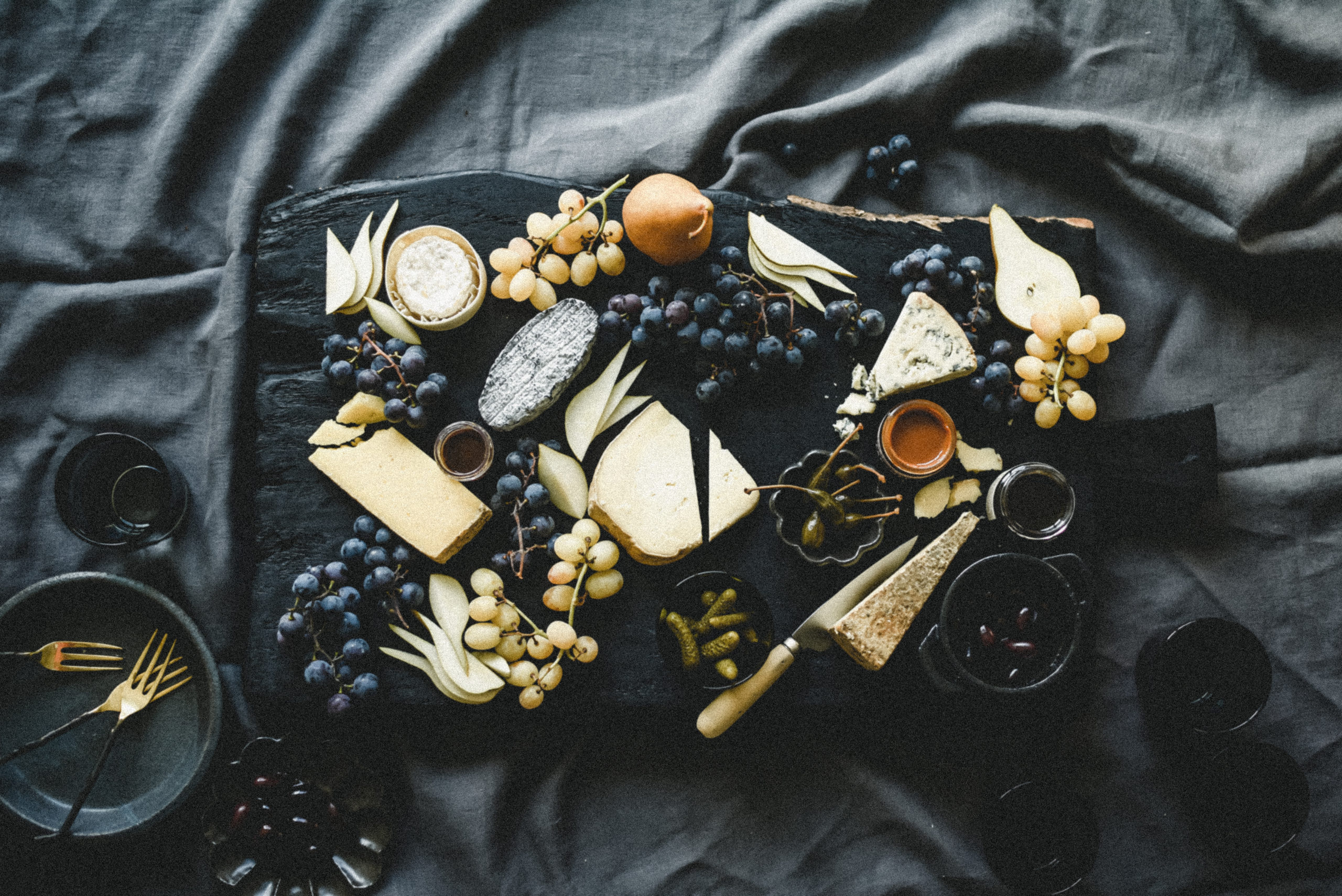
Really feeling stuck on how to photograph your subject? Divide it up. Maybe even change the composition altogether. Divide the subject into servings and put them on small plates, or into small bowls. Place them in a grid, or in a more organic flow. Simply have fun with it – and try to think outside the box! There’s no “right” way to photograph a mushy dish, so you’ll likely find success in the experimentation of it.
Eat.
Or, rather, envision eating the dish. Think about what you would commonly eat the subject with. Are there spices, or sauces, or even flavor cues that can help tell the story? What goes with your dish?
If nothing comes to mind, think of what can help communicate what is inside of the dish. What can you add to help the illusion of a real-life scenario?
For example, you can pair mac and cheese with blocks of the type of cheese inside it. Those blocks are angular and more structured with leading lines in comparison to the curves and globs of mac and cheese.
Or, with mashed potatoes, you can add gravy to the mix, and get the big, beautiful gravy boat in your shot! And maybe even throw in a gravy spoon for those nice lines, too.
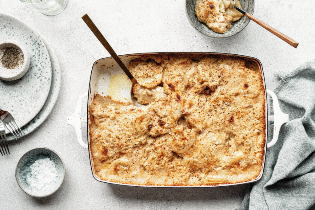
Light.
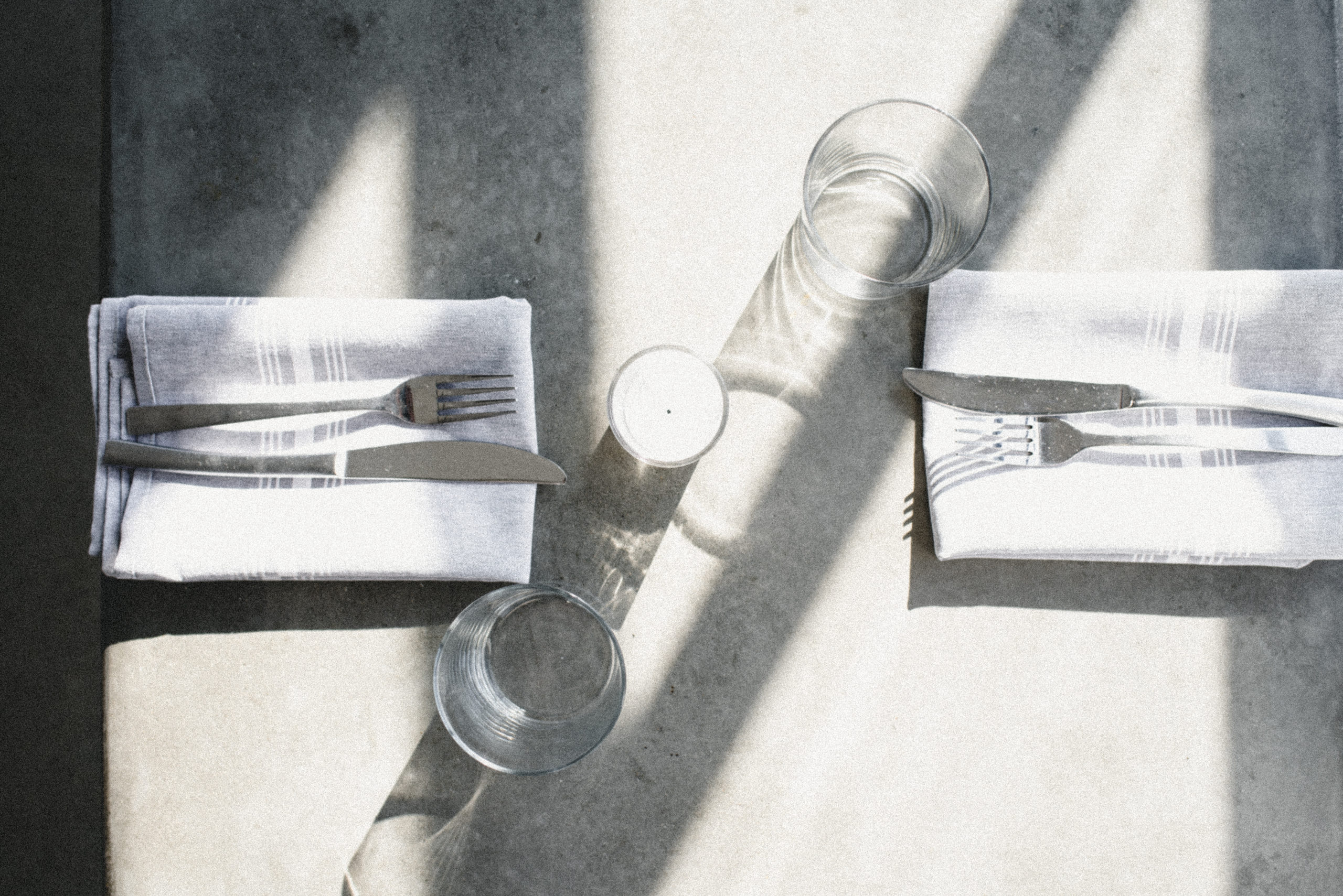
Playing with lighting always makes a huge difference. Shift your shadows by playing with the light, and add some drama either by using less light, or directing it with shadows by blocking the source.
Move the subject, rotate it, and try to understand the relationship with the light. (Pro tip: this doesn’t only apply to mushy foods — it works for almost all food photos!)
Frame.
When your subject is looking lonely or feeling flat, think about how the surface or dinnerware the subject is placed in or on can be adjusted to improve it.
Can a thicker rimmed plate break up the space between the subject and surface? Is there any depth? How dynamic is it? Can placing the subject on an oval plate make more of an impact than an octagonal one? This is another opportunity to think outside the box!
In Conclusion to Styling Mushy Subejcts:
I hope you found this post for styling mushy subjects helpful, and that you enjoy styling as much as you enjoy eating your oh-so-comforting meals! (Extra mashed potatoes for me, please.)
Click here to save this post for later on Pinterest, or here to browse my favorite comfort food recipe!
